Oliver's Wharf, Wapping, London.
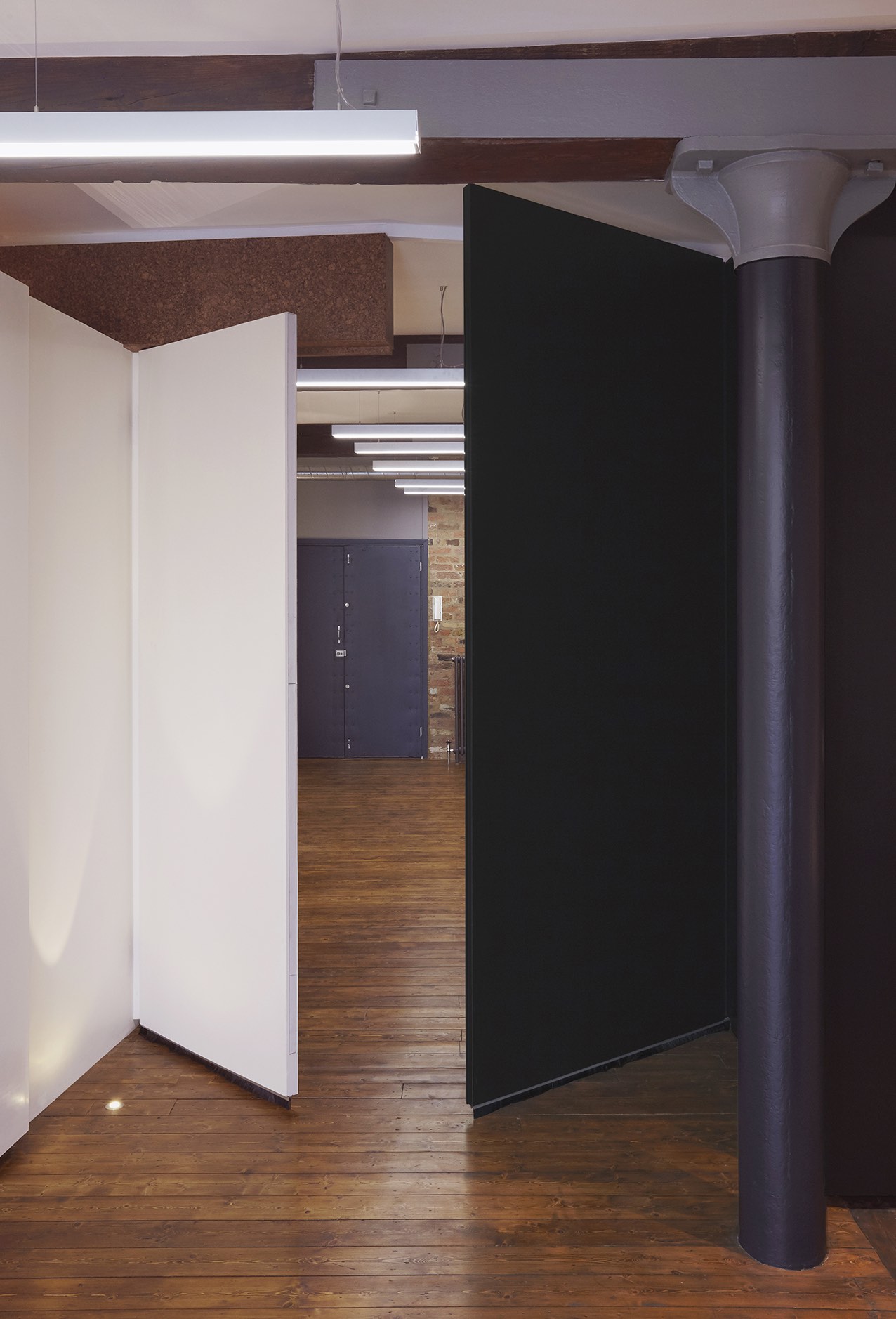
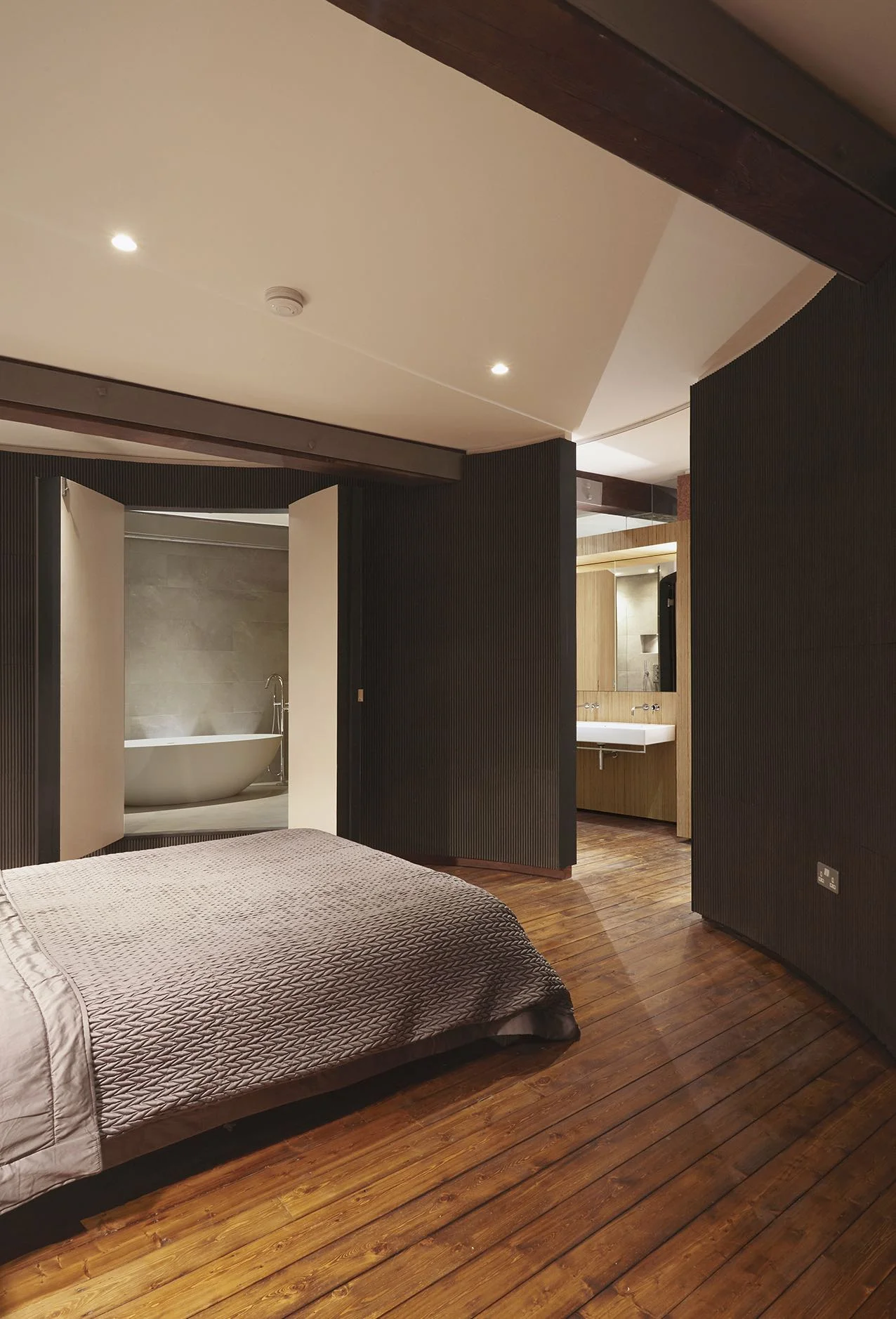
Interior as a landscape of sculptural boxes and screens. How to best use dark window less areas of an apartment and retain a sense of open-plan warehouse whilst subdividing space. Materials = sound + vision.
This project involved the full refurbishment of an apartment within Olivers Wharf, a Grade II listed Victorian warehouse building on the river Thames. The brief was for a new concept driven interior design to replace the existing dated layout and aesthetic so the first move was to strip out all non-load bearing pastiche brick partitions, interior fixtures, fittings and services and to initially return the warehouse to one single large open plan volume with its 3 original elements: brick perimeter walls, cast iron columns and oak beams.
The design concept alluded to the industrial past of the space, in distributing a series of angled free standing ‘box’ objects and ‘material planes’ across the floor area of the warehouse to define different zones of use instead of carving it up with traditional rooms and walls. The use of angles was a result of accommodating the client brief in opposition to the regular structure of the original architecture, whilst also increasing views past and between newly inserted elements. In addition these elements were stopped short of the ceiling allowing the original oak beams to oversail them visually so that the new design helped to reinforce the overall scale and volume of the warehouse space rather than detract from it.
Careful attention was given to connection details so that old and new fabric related and responded directly to each another rather than the new imposing on the old. Each newly built element was made distinct from every other (and separate to the existing warehouse architecture) by being clad in a different material and in turn create a collage of expensive and inexpensive materials. From OSB board to polished plaster, cork to antique mirror, rubber to recycled leather and plywood to concrete tiles, the overall ambience of the apartment became one of variety and contrast.


![Detail-[Converted]2-forweb.jpg](https://images.squarespace-cdn.com/content/v1/5adde351697a987675ddfa80/1594749504901-Q6WXB6JCR0CBKS6QNV7W/Detail-%5BConverted%5D2-forweb.jpg)


